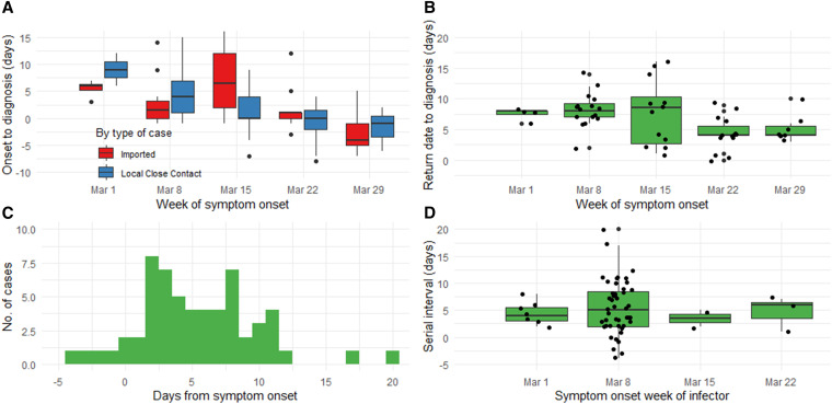
Figure 2.
A, (Top left) Boxplot of the duration between symptom onset to diagnosis among symptomatic and presymptomatic cases only, by week of symptom onset and by type of case: imported (in blue) and local case contact (in red). Black dots above and below each boxplot indicate outliers; (B, top right) boxplot of the exposure period of the 53 imported cases to their local contact cases (using their return dates to Brunei as the start point), by week of symptom onset. Black dots represent each case, jittered for visual clarity; (C, bottom left) histogram showing the serial interval (SI) distribution for the 59 symptomatic infector–infectee pairs; (D, bottom right) boxplot showing variations in the SI distribution by the symptom onset week of the infector. Black dots represent each case, jittered for visual clarity. This figure appears in color at www.ajtmh.org.

