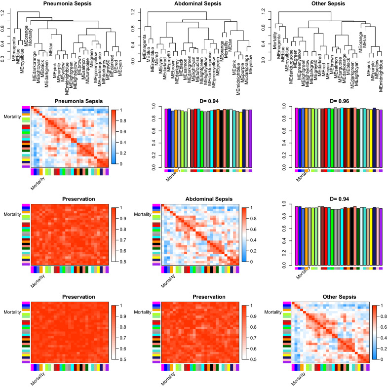
Fig. 3.
Summary plot of consensus eigengene networks and their differential analysis. The top 3 panels show the dendrograms (clustering trees) of the consensus module eigengenes in the 3 datasets of pneumonia, abdominal and other sepsis. Below, the eigengene networks in the three sets are shown as heatmaps labeled penumonia sepsis, obdominal sepsis and other sepsis. In the heatmaps, red denotes high adjacency (positive correlation) and blue denotes low adjacency. The Preservation heatmap shows the preservation network, defined as one minus the absolute difference of the eigengene networks in the two datasets. The barplot shows the mean preservation of adjacency for each of the eigengenes to all other eigengenes; in other words, the barplot depicts the column means of the preservation heatmap

