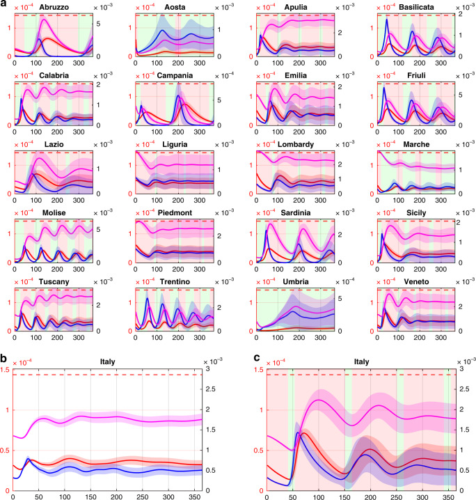
Fig. 3. Intermittent regional measures.
a Each of the 20 panels shows the evolution in a different region of the fraction in the population of infected (blue), quarantined (magenta) and hospitalized requiring ICUs (red) averaged over 10,000 simulations with parameters sampled using a Latin Hypercube technique (see Methods) around their nominal values set as those estimated in the last time window for each region as reported in Supplementary Table 4. Shaded bands correspond to twice the standard deviation. Dashed red lines represent the fraction of the population that can be treated in ICU (). Regions adopt lockdown measures in the time windows shaded in red while relax them in those shaded in green. During a regional lockdown, fluxes in/out of the region are set to their minimum level. b National evolution of the fraction in the population of infected (blue), quarantined (magenta) and hospitalized requiring ICUs (red) obtained by summing those in each of the 20 regions adopting intermittent regional measures. c National evolution of the fraction in the population of infected (blue), quarantined (magenta) and hospitalized requiring ICUs (red) when an intermittent national lockdown is enforced with all regions shutting down when the total number of occupied ICU beds at the national level exceed 20%, reopening when it goes back below 10%. Regional dynamics corresponding to this scenario are shown in Supplementary Fig. 4. All plots are shown with a double scale. The scale on the left vertical axis (in red) applies to the hospitalized requiring ICU and the ICU beds capacity threshold, while the right vertical axis (in black) applies to the infected and quarantined. The time scale, on the horizontal axis, is given in days.

