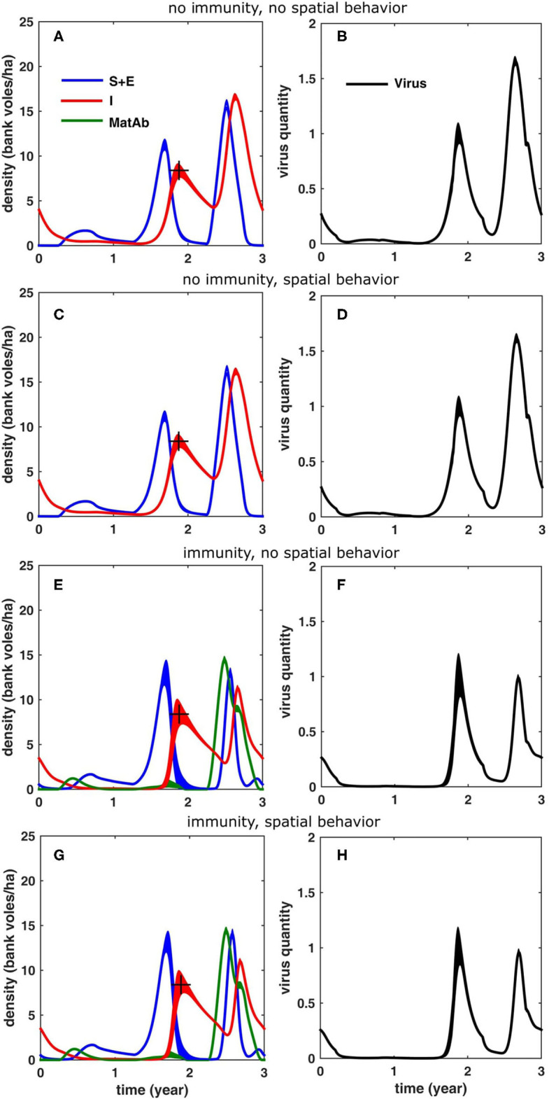
Figure 5.

Simulation results for a 3-years cycle (averaged over 100 cycles; the width equals twice the standard deviation) for the different scenarios, see text: (A,B) without reduced home range in the peak year and without inclusion of immunity due to maternal antibodies, (C,D) with reduced homerange only, (E,F) with inclusion of immunity only and (G,H) with inclusion of both immunity and reduced homerange. The figures in the left column (A,C,E,G) show the density of bank voles with the respective infection statuses (blue: susceptible and exposed, red: infectious, green: protected by MatAb); the figures on the right (B,D,F,H) show the corresponding amount of virus that was accumulated in the environment. The “+” marks the infectious bank vole density level (8.4 voles/ha) that was used to fit the model (through β, see Table 1).
