
FIGURE 6.
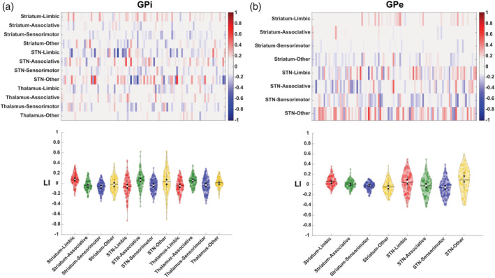
Distribution of lateralization index (LI) computed according to streamlines density index values at subject level. (a) The matrix reports LI values for each connectivity patterns and for each subject. Left‐lateralized maps (LI > 0.1) are depicted in red while right‐lateralized maps (LI < −0.1) are portrayed in blue. The color bar refers to the strength of lateralization: the higher the color intensity, the higher is the degree of hemispheric dominance. (b) Violin plots report the distribution of the LI and the degree of lateralization. The violins ad data points are colored according to the following color coding: associative (green), limbic (red), sensorimotor (blue), other (yellow). The solid black lines of the violins depict the mean value of the distribution; the white circle depicts the median point and the black triangles represent the notch as the 95% confidence interval around the median. The vertical gray line depicts the 25th and 75th percentiles