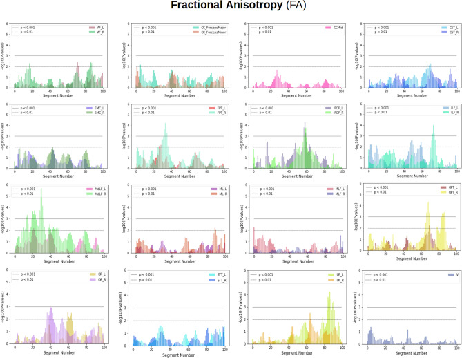
Figure 2.
Showing plots summarizing population differences for fractional anisotropy (FA) using LMM for 30 bundles along their length. On the x-axis, we have segment numbers and on the y-axis, we have negative logarithms of p values. In the plots, the horizontal lower line indicates a p value < 0.01 and the horizontal upper line indicates a p value < 0.001. The p value at a specific segment implies how much significant FA group differences are there between patients and healthy controls for that particular bundle. Most plots show left and right bundles of the same type except V and CCMid. The plot at first row, second column shows simultaneously Minor and Major Forceps of CC. The rest of the plots show the left and right parts of the same type of bundle e.g. AF left (AF_L) vs AF right (AF_R). Notice for example that the IFOF bundles (left and right) are significantly different around segment 60.

