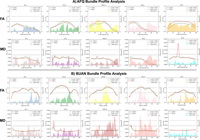
Figure 6.
Bundle profile analysis was carried out on PPMI data of 32 control and 32 patient subjects. The figure shows results for five major bundles, AFL, CSTL, IFOFR, ORR, and UFR. The 2-sample independent t-test was carried out on AFQ bundle profiles of subjects to get significant group differences along the tract. For BUAN, linear mixed models (LMM) was run to get significant group differences along the tract. (A) shows AFQ bundle profile results on 5 bundles and (B) shows BUAN results on the same data. In both (A) and (B), the first row has mean bundle plots for fractional anisotropy (FA) and second row has mean bundle plots for mean diffusivity (MD). Each plot has a mean bundle profile for the control group in green and a mean bundle profile for the patient group in red. On the x-axis, we have length along the tract/segment number, on the left y-axis, we have mean anatomical values and the negative logarithm of p values on the right y-axis of the plots. In the plots, the horizontal lower line indicates a p value < 0.01 and the horizontal upper line indicates a p value < 0.001.

