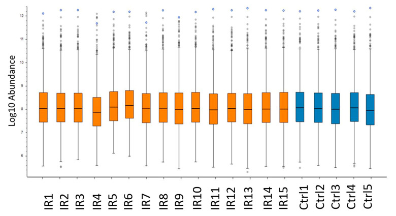
Figure 3.
Comparison of protein abundance between heart samples. The box-and-whisker plot shows the abundance of the not-normalized intensity values for each individual of irradiated (IR) and control (Ctrl) groups. The analysis was performed using the Proteome Discoverer 2.3 software (Thermo Scientific, Waltham, MA, USA). Detailed information of the sample donors and the exact doses are given in Table S4.

