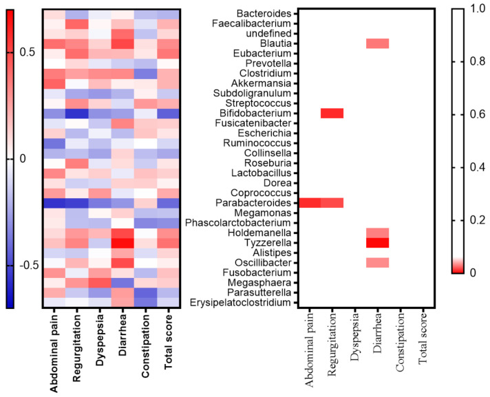
Figure 6.
Heat map showing changes in the relative abundance of genera after the metformin treatment in the subgroup. The association between the changes in gastrointestinal symptoms and changes in the relative abundance of genera before and after four weeks of medication were compared. The top 20 genera are shown along the y-axis and the gastrointestinal symptoms are shown along the x-axis. The left panel shows the correlation coefficients. Red denotes a positive association and blue denotes a negative association (Spearman’s correlation coefficient). The right panel shows the p-values (Spearman’s correlation coefficient). Red indicates a p-value < 0.05.

