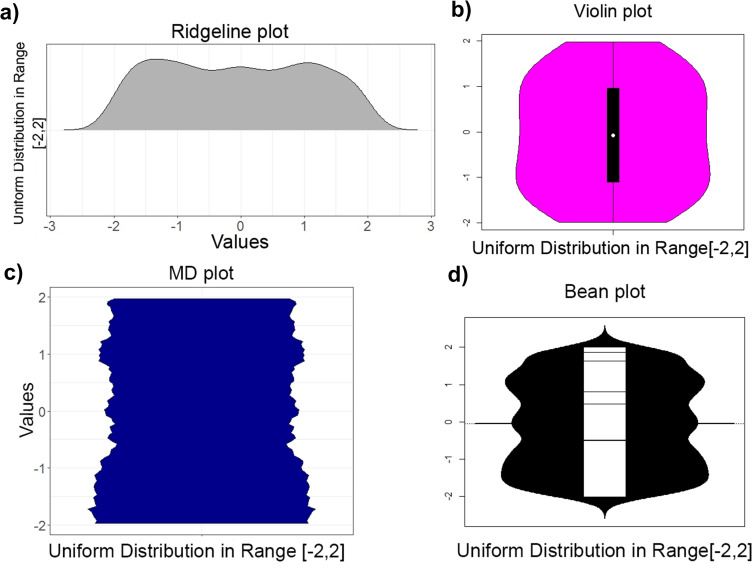
Fig 1.
Uniform distribution in the interval [−2,2] of a 1 000 points sample visualized by a ridgeline plot (a) of ggridges on CRAN [41] (top left) and violin plot (b, top right), bottom: bean plot (d, right) and MD plot (c, left). In the ridgeline, violin and bean plot, the borders of the uniform distribution are skewed contrary to the real amount of values around the borders 2,−2. The bean plot and ridgeline plot indicate multimodality but Hartigan’s dip statistic [12] disagrees: p(n = 1 000,D = 0. 01215) = 0.44.

