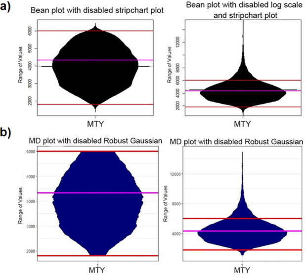
Fig 6. MTY feature clipped in the range marked in red with a robustly estimated average of the whole data in magenta (left) and not clipped (right).

The bean plot (a) underestimates the density in the direction of the clipped range [1800, 6000] and draws a density outside of the range of values. Additionally, this leads to the misleading interpretation that the average lies at 4000 instead of 4300. The MD plot (b) visualizes the density independently of the clipping. Note that for a better comparison, we disabled the additional overlaying plots.
