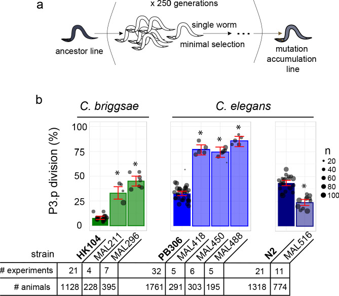
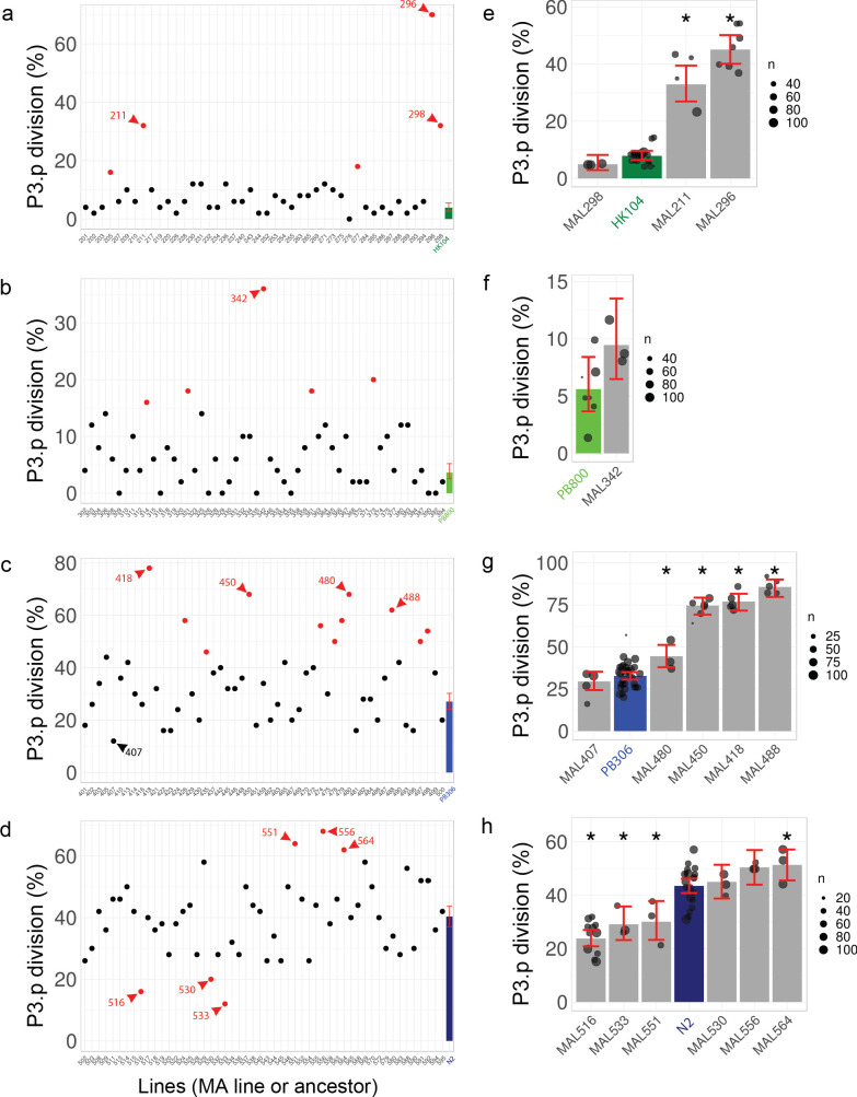
Figure 2. Choice of Caenorhabditis MA lines displaying evolution of P3.p cell fate compared to their ancestral line.
(a) Schematic depiction of the generation of mutation accumulation (MA) lines. Starting from an ancestral line, each new generation is propagated through a single worm for many cycles (250 generations in the present case). This treatment with minimal selection at low population size increases the likelihood of fixing de novo spontaneous mutation by drift. (b) The panel of this study consists of three cohorts of ancestral lines and derived MA lines, one in the nematode species C. briggsae (derived from HK104 ancestor, colored in green in the figures) and two in C. elegans (derived from ancestors PB306 and N2, in blue). The bar charts represent the mean frequency of P3.p division for each strain in the three cohorts over several replicate experiments. Each dot represents an independent experiment, with dot size scaled to the number of scored individuals (n). The ancestral line is the leftmost strain (in bold). The number of independent experiments and individuals are indicated below the graphs. Stars indicate a significant difference with the ancestor line (Fisher's exact test) and error bars indicate 95% confidence intervals.


