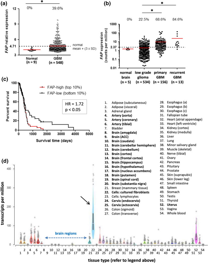
Figure 1.

FAP expression in transcriptomic analyses of glioblastoma and normal tissues. (a, b) FAP gene expression values from TCGA microarray (a) and RNAseq (b) datasets. The expression value for each tissue sample is shown. Red lines represent the median of each group, while dotted lines represent the threshold for FAP expression, based on [mean + (3 × SD)] of the respective normal brain dataset. The proportion of samples in each group with expression above the threshold is indicated at the top of the graphs. In a, groups were compared by the Mann–Whitney U‐test (P < 0.01). In b, all groups were compared using the Kruskal–Wallis test (P < 0.0001); pairwise comparisons significant by Dunn’s post‐test are indicated by asterisks. The number of samples in each dataset is indicated on the graphs. (c) Microarray data from the TCGA GBM dataset were used to perform Kaplan–Meier survival analysis comparing overall survival of patients whose tumors were in the top 10% (FAP‐high) or bottom 10% (FAP‐low) of the expression range for FAP (n = 53 for each). Patients with FAP‐high tumors had significantly poorer survival. (d) FAP gene expression values, measured by RNAseq, were obtained from the GTEx portal for 51 normal tissue types and compared to cultured skin fibroblasts (black arrow; positive control). Box plots show median and 25th and 75th percentile; points are displayed as outliers if they are above or below 1.5 times the interquartile range. Number of samples analysed per tissue type ranged from 4 to 803, with a mean of 325. Blue dotted arrow highlights the 13 regions of brain tissue analysed.
