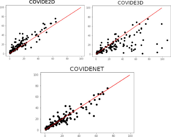
Fig. 5.
Plots indicating the correlation between the average disease extent measured from CovidE2D, CovidE3D and CovidENet respectively and the manual segmentation. Disease extent is expressed as the percentage of lung affected by the disease. The red line shows a perfect correlation (Spearman ). Spearman correlation coefficients are displayed for each comparison. (For interpretation of the references to color in this figure legend, the reader is referred to the web version of this article.)

