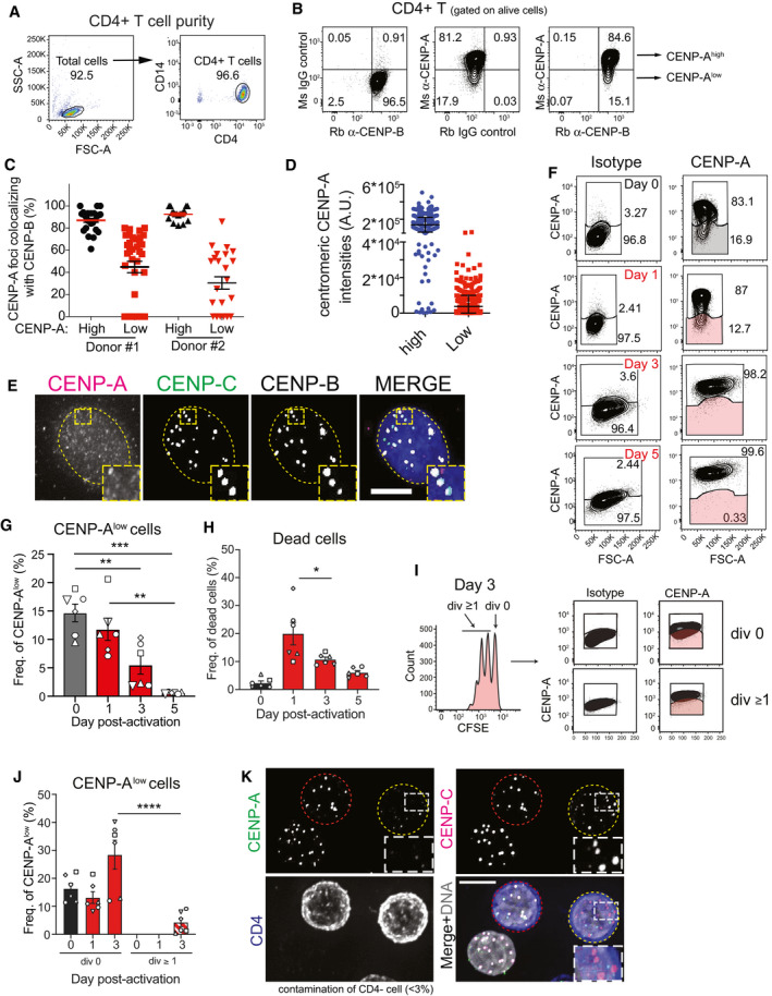
Representative FACS plots showing the efficiency of total CD4+ T‐cell purification from human blood PBMCs.
Representative FACS plots showing gating of CENP‐B-positive/CENP-A‐high and CENP‐B-positive/CENP-A‐low populations of freshly purified human CD4+z T cells based on isotype controls. Ms = mouse; Rb = rabbit.
Graph showing CENP‐A foci identified in high or low CENP‐A expressing cell colocalizing with CENP‐B foci in two donors. Each dot represents the percentage of CENP‐A/B colocalizing in one cell. Error bar shows SEM.
Quantification of centromeric CENP‐A level in high or low CENP‐A expressing CD4+ T cells. Each dot represents one centromere. Error bars show standard deviation.
Representative immunofluorescence images showing CENP‐B- and CENP‐C-positive centromeres, but lacking CENP‐A in a CD4+ T cell. Nucleus is contoured by a dashed yellow line. Scale bar, 5 μm
Representative plots showing CENP‐A expression vs. forward scatter area (FSC‐A), which determines the relative size of CD4+ T cells after activation. Gates represent the frequency of CENP‐A high and low populations in total CD4+ T (shaded gates represent CENP‐Alow cells).
Graph representing the absolute number of CFSE‐high/CENP‐A-low CD4+ T cells during the experimental kinetics. One‐way ANOVA, multiple comparisons, n = 6 (each symbol represents a different donor). **P < 0.01, ***P < 0.001.
Graph showing the frequency of dead cells in CD4+ T cell cultures over time. One‐way ANOVA, multiple comparisons, n = 6 (each symbol represents a different donor). Error bars show SEM. *P < 0.05
CFSE dilution and CENP‐A expression at day 3 post‐activation. Representative FACS plots showing CENP‐A expression in CD4+ T cells that have not divided (div 0) and those that have divided once or more times (div ≥ 1), gated based on CFSE dilution. Gates in CENP‐A plots were set based on isotype control for each specific population (cells in shaded gates are CENP-A‐low CD4+ T cells).
Graph representing the frequency of CENP‐A low cells (shaded gate in I). One‐way ANOVA, multiple comparisons, n = 6 (each symbol represents a different donor). Error bars show SEM. ****P < 0.0001.
Representative immunofluorescence images showing CENP‐A, CENP‐C, and CD4 staining after FACS. Cells with centromeric CENP‐A are marked with a red dashed contour line, while a yellow contour line marks cell without centromeric CENP‐A. Scale bar, 5 μm.