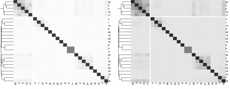
Fig 9. Example of heatmaps adapted from Fig 1.
Left: Heatmap obtained by converting Fig 1 (right) to gray scale. If the only relevant information concerns the min and max values, this heatmap is suitable. Right: Midrange values are more visible, thanks to a negatively clipped sequential color palette, i.e., the mapping of the data values is shifted to the darker range of the gray scale. The values of the Jaccard index around 0.5 are brought into the foreground and are more visually pronounced.

