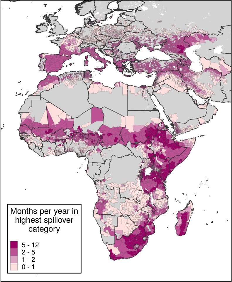
Figure 5.
Average number of months per year in the highest spillover category.
Caption: Each district is colored by how many months per year, on average, it was in the top spillover quintile of districts at risk of RVF. Districts in darker purple were in the top quintile most often. Districts in grey were never in the top quintile.

