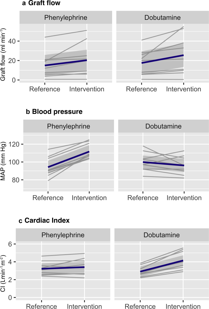
Fig 2.
Spaghetti plot for change in graft flow, MAP, and cardiac index. The plots show the value for graft flow (a), mean arterial pressure (b) and cardiac index (c) for all patients. Two values were plotted per patient – that is the mean in the reference phase and the mean in the intervention phase. For visualisation purposes, spaghetti plots were made. The graphs on the left represent the results for the phenylephrine stage, whereas the graphs on the right represent the results obtained in the dobutamine stage. The blue line shows the mean change with standard deviation for all patients combined.

