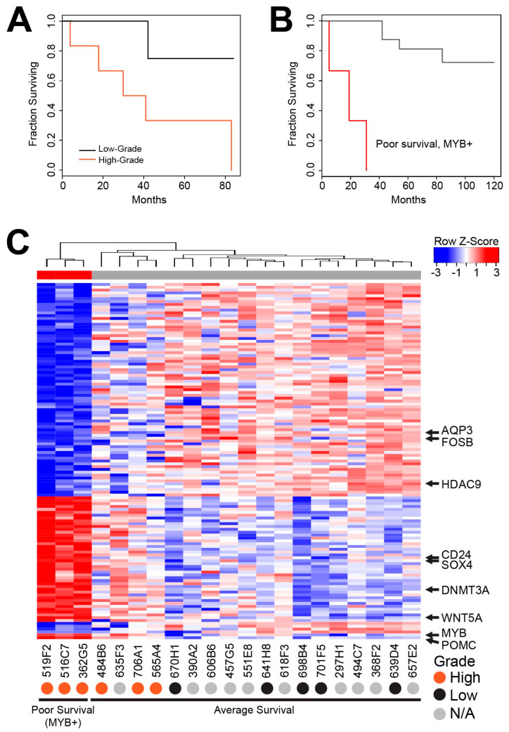
Figure 3.
Poor survival subgroup of AcCC Tumors. (A) Kaplan–Meier survival curve comparing the high-grade transformation samples (orange) to low-grade samples (black). Note: grade information was not available for some samples, they were excluded; (B) Kaplan–Meier survival curves comparing the MYB-expressing (red) group from Figure 2 with all other samples (gray); (C) heatmap summarizes the differences in gene expression between the poor survival subgroup (left, red color bar) and the rest of the samples (gray color bar). Positions of some noteworthy genes are marked. Full-sized heatmap with all the genes labeled is provided in Figure S3.

