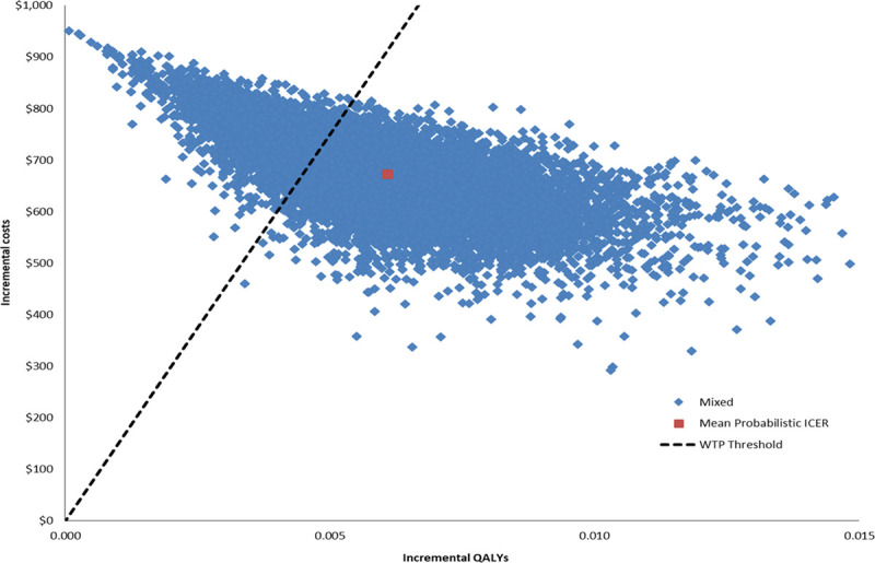
Figure 3.

Probablistic sensitivity analysis. The scatterplot depicts the range of incremental cost-effectiveness ratio (ICER) given probabilistic variation in model inputs. Blue dots represent individual ICER data points, whereas the red dot represents the mean ICER from the probabilistic data points. The dashed line represents the willingness-to-pay (WTP) benchmark. The ICER remained lower than the WTP in the majority (74%) of iterations. QALY indicates quality-adjusted life year.
