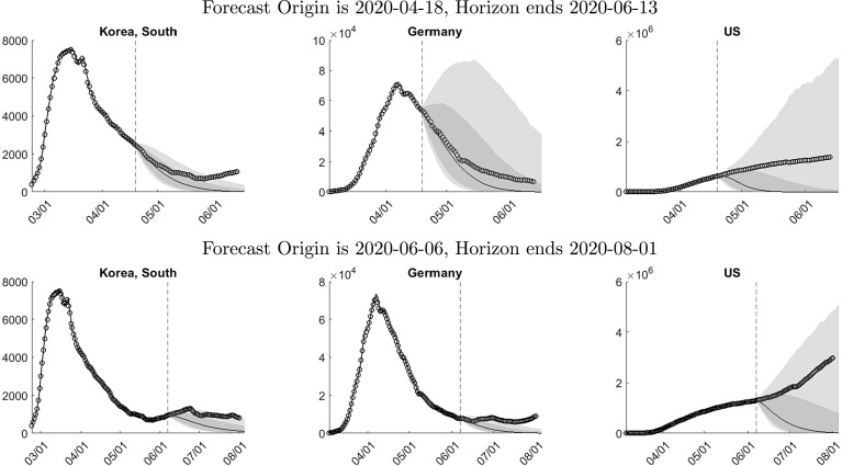
Fig. 9.
Interval forecasts and actuals. Notes: The vertical lines indicate the forecast origins. The circles indicate actual infections. The solid lines prior to the forecast origin represent in-sample one-step-ahead forecasts. The solid lines after the forecast origin represent medians of the posterior predictive distribution. The gray shaded bands indicate the 20%–80% (dark) and 10%–90% (light) interquantile ranges of the posterior predictive distribution.

