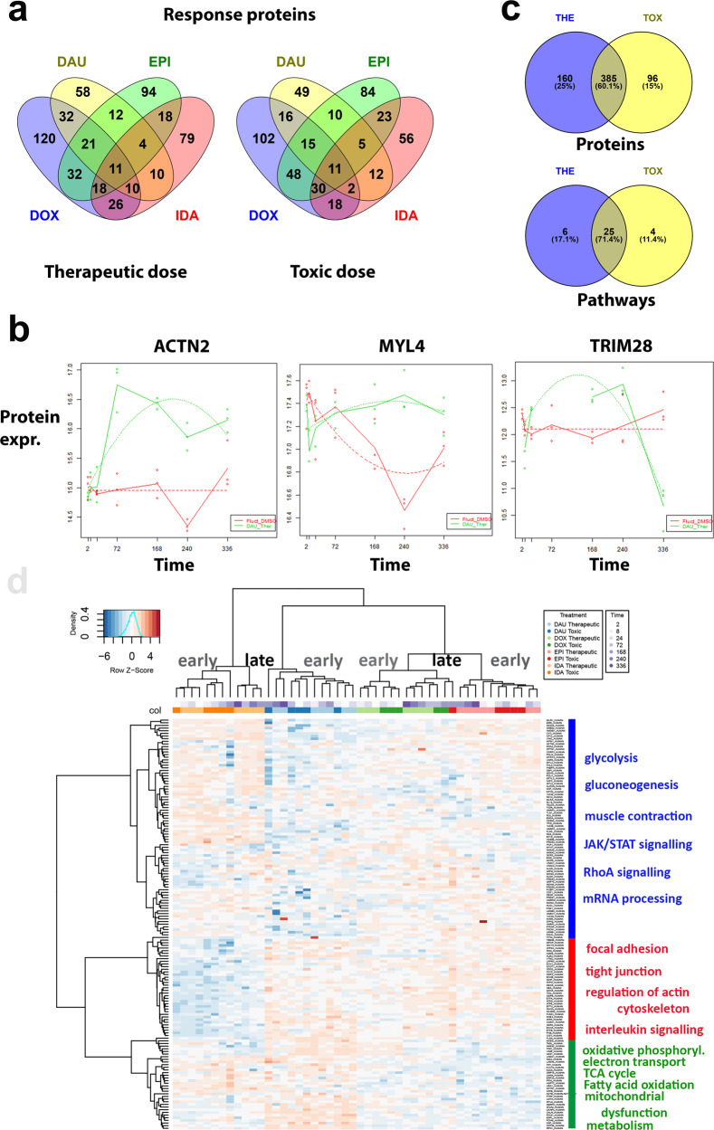
Fig. 2. Dynamic proteome changes upon AC treatment.
a VENN diagrams (generated with Venny 2.1.0) of dynamically altered proteins after AC treatment (DOX: blue, DAU: yellow, EPI: green, IDA: red) measured with LC–MS at therapeutic and toxic doses. b Examples of polynomial regression fit (degree ≤ 2) for significantly altered sarcomere genes (ACTN2, MYL4) and transcriptional regulators (TRIM28). The curves of the regression fit are plotted as dotted lines, solid lines connect the median values of the three replicates per time point to visualize the trend over time. Dots: experimental values, red curves: DMSO control experiments, green curves: AC treatment (DAU). Y-axes: normalized protein expression, X-axes: time. c VENN diagram showing overlap of proteins dynamically altered upon AC treatment according to therapeutic (THE) and toxic (TOX) doses. Overlap is counted with respect to proteins and enriched pathways. d Hierarchical clustering of protein expression over all experiments using the h.clust() method in R with Eucledian distance as distance measure and Ward’s method (option “ward.d2”) as agglomeration method. Upper panels code for the different treatments and the different time points per treatment. Right panel describes the major enriched functional pathways of the three main clusters of proteins.

