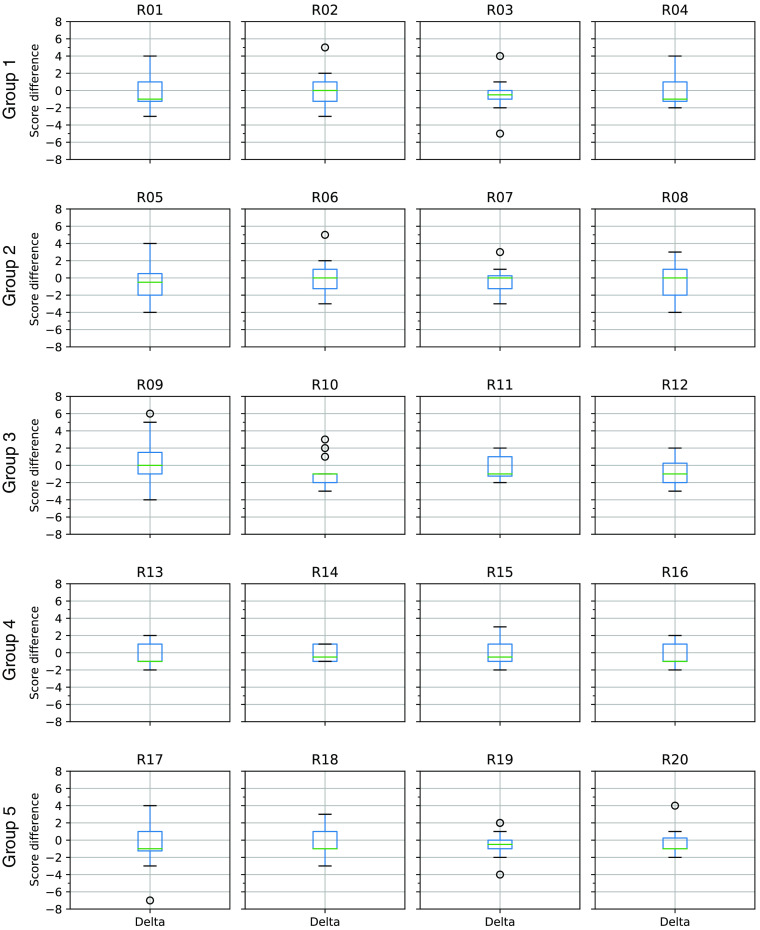
Fig. 7.
Boxplots showing the distribution of radiologists’ score differences by test group. The R numbers correspond to individual radiologists. For example, R01 refers to radiologist #1. Each row of plots corresponds to a specific group of 20 test exams. Thus, radiologists R01 through R04 all scored the same 20 exams in group 1. The score difference is defined as the radiologist score for the technician segmentation minus the radiologist score for the DL segmentation. Negative values indicate that the DL segmentation was assigned a higher (better) score than the technician segmentation. Each box shows the range of data values between the first and third quartiles. The horizontal line within each box indicates the median value. The whiskers indicate the range of values. Outliers are indicated by small circles beyond the whiskers. Variability between radiologists, both within and between groups, is evident as differing box sizes and whisker lengths.

