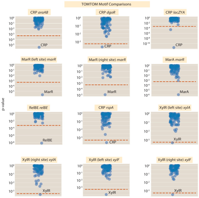
Appendix 2—figure 4. A visual display of the results of the TOMTOM motif comparison between the discovered binding sites and known sequence motifs from RegulonDB and our prior Sort-Seq experiment (Belliveau et al., 2018).
Each dot in a given panel represents a comparison between the target position weight matrix (given in the figure title) and a position weight matrix for a given transcription factor. The p-value is calculated using the null hypothesis, that both motifs are drawn independently from the same underlying probability distribution. The red dotted line is displayed at a p-value of . The line represents a p-value threshold of 0.05 that has been corrected for multiple hypothesis testing using the Bonferroni correction (95 motifs were compared against the target for a p-value threshold of ). Numeric values for the displayed data can be found in Appendix 2—figure 4-source data 1.

