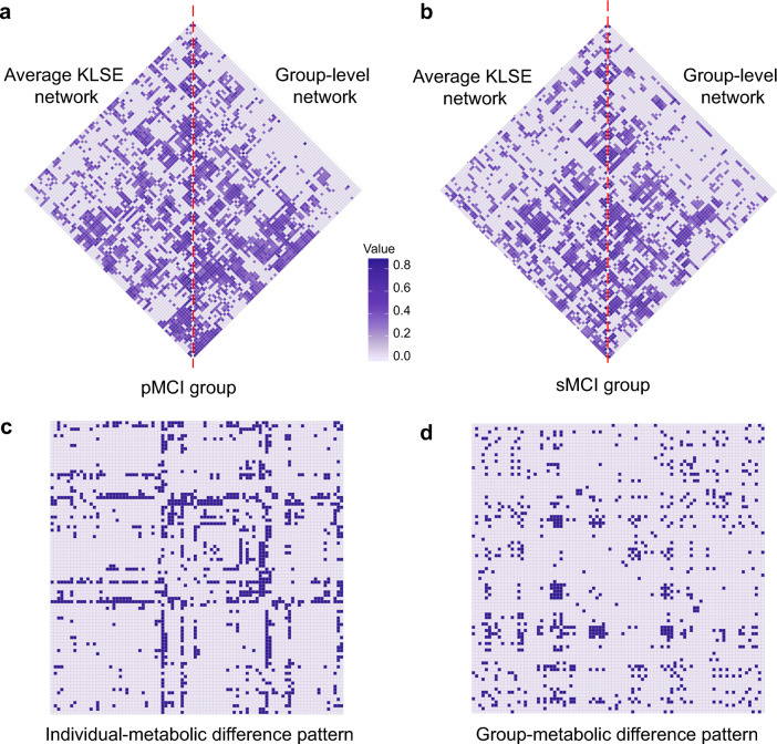
Fig. 2.
Metabolic network topology in the pMCI group (a) and sMCI group (b). The matrices represent the mean average metabolic network based on the KLSE method (left triangle) and a group-level metabolic network based on a conventional Pearson’s correlation method (right triangle). The color intensity indicates the strength of metabolism correlations. Metabolic difference patterns of predictive of MCI-conversion are shown for individual- (c) and group-level (d) networks. For calculating the individual-level pattern, we first applied Fisher’s Z-transformation to the metabolic network of each MCI subject. Next, we compared the Z-coefficients of the pMCI and sMCI groups using a two-sample t test with false discovery rate (FDR) correction. For calculating the corresponding group-level pattern, we likewise applied Fisher’s Z-transformation and corrected P values for FDR. P < 0.05 was considered significant. Each row (column) in the matrix corresponds to one of the 90 VOIs. Purple cells represent significantly different connectivity

