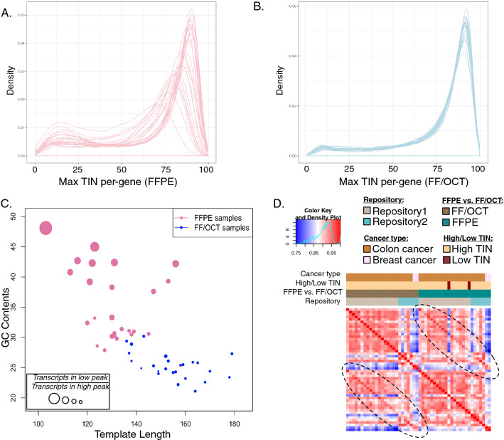
Figure 3.
Analysis of FFPE and FF/OCT RNA replicate quality and similarity. Distributions of per-gene TIN in (A) FFPE vs. (B) FF/OCT replicates are shown. Each line represents a single sample in the cohort. (C) Per-sample quality and proportion of transcripts with low TIN are reflected by GC content vs. average template length in FFPE (pink) and FF/OCT (blue) samples. The proportion of genes in the lower peak vs. those in the higher peak in the distributions as shown in (A) and (B) are indicated by the point size. (D) In the correlation heatmap for the combined cohort or replicates, a brighter red color represents greater sample similarity. Samples are ordered the same across both rows and columns. The two peripheral brighter red diagonals indicate these samples are most similar to their FFPE or FF/OCT counterpart than other samples in the same cohort. Sample annotations are described by the color legend.

