Figure 5.
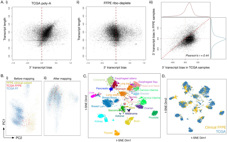
Mapping of the TCGA poly-A cohort to FFPE ribo-deplete samples. Comparison of transcript bias between the two cohorts reveals (Ai) strong 3′ bias in TCGA poly-A data (the biggest point density is leaning in the y = x direction, to the right of the x = 0 line) and (Aii) slight 5′ bias in FFPE ribo-deplete data (the biggest point density is leaning slightly to the left of the x = 0 line). In parts (Ai) and (Aii), the dashed red line shows the position on the x-axis where the transcript bias is 0. (Aiii) When graphed together, TCGA transcripts have a clear 3′ bias compared to the same transcripts in the FFPE cohort. (B) PCA projection of the first 2 principal components of combined FFPE and TCGA cohorts before (i) and after (ii) mapping of TCGA into FFPE RNA-Seq space is represented. (C) Shown is a t-SNE projection of the FFPE and TCGA cohorts after the mapping method is applied to TCGA; samples are colored by the cancer type. (D) The same t-SNE projection as in (C) is shown, but now colored by sample cohort. FFPE samples are yellow, TCGA samples are blue. TCGA and FFPE cohorts mix across cancer type groupings.

