
Figure 1.
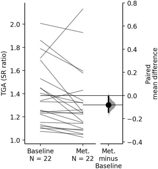
The paired mean difference of TGA between baseline and metronome (Met.) for the study group is shown in the above paired mean difference plot. The raw data is plotted on the left axes, where each paired set of subject observations is connected by a line. On the right axes, the paired mean difference is plotted as a bootstrap sampling distribution. Mean difference is depicted as the dot; 95% CI are indicated by the ends of the vertical error bars. The paired mean difference of TGA between baseline and metronome condition is −0.08 [95.0%CI −0.144, −0.006], p = 0.032.