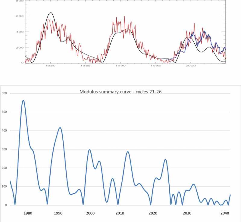
Figure 2.

Top plot: The modulus summary curve (black curve) obtained from the summary curve (Figure 1, bottom plot) versus the averaged sunspot numbers (red curve) for the historical data (cycles 21–23). Bottom plot: The modulus summary curve associated with the sunspot numbers derived for cycles 21–23 (and calculated for cycles 24–26 (built from the data obtained by Zharkova et al. [1])).
