Fig. 4.

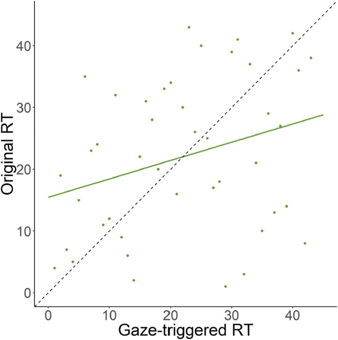
Scatterplot of the ranked average reaction time (RT) values for each participant between both conditions. The dashed line indicates what the ideal distribution of the data would be and the colored line represents the best fit to the data

Scatterplot of the ranked average reaction time (RT) values for each participant between both conditions. The dashed line indicates what the ideal distribution of the data would be and the colored line represents the best fit to the data