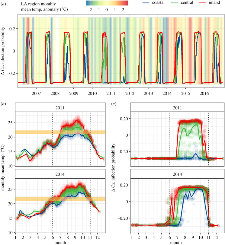
Figure 3.
Weekly trends in (a) the marginal effects of monthly mean temperature on Cx. infection probability in each of the three LA climate zones from 2006 to 2016. The background colour in (a) shows the average mean monthly temperature anomaly for the entire study area (difference from 2006 to 2016 average for that month). Weekly trends in (b) monthly mean temperature and (c) the marginal effects of monthly mean temperature on Cx. infection probability in an anomalously cool year (2011), and an anomalously warm year (2014) are also shown. The yellow box in (b) marks the narrow transitional temperature range (21.0–22.7°C) that lies between inhibitory and favourable temperatures. The dotted vertical lines highlight the months in which transmission typically occurs, June through October. Trend lines represent weekly averages for each region. (Online version in colour.)

