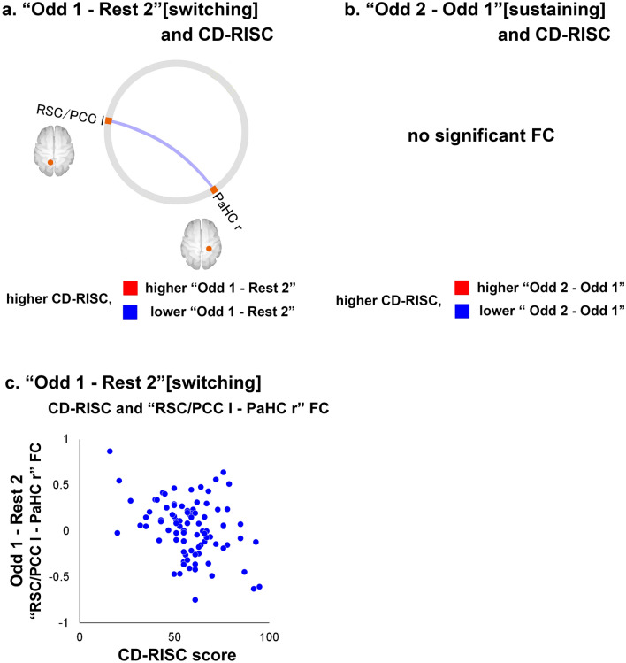
Figure 4.
(a) FCs with a significant correlation between CD-RISC scores and the difference between the “Rest 2” and “Odd 1” (“Odd 1 − Rest 2” [switching]) periods (FDR-corrected p < 0.05). The blue line indicates that there was a negative correlation between the value of the “Odd 1 − Rest 2” period and CD-RISC scores. (b) FCs with a significant correlation between CD-RISC scores and the difference between the “Odd 1” and “Odd 2” (“Odd 2 − Odd 1” [sustaining]) periods (FDR-corrected p < 0.05). There was no significant FC. (c) Scatterplot of the relationship between CD-RISC scores and the “RSC/PCC l-PaHC r” FC of “Odd 1 − Rest 2”. The X-axis of the scatterplot indicates the CD-RISC scores. The Y-axis indicates the “RSC/PCC l-PaHC r” FC values of “Odd 1 − Rest 2” (subtraction of the Fisher’s Z-score of “Rest 2” from that of “Odd 1”). Orange ROIs: ventral DMN. Yellow ROIs: dorsal DMN. ROI region of interest, DMN default mode network, r right, l left, lr left and right, PCC posterior cingulate cortex, PaHC parahippocampal cortex, RSC retrosplenial cortex, CD-RISC Connor–Davidson Resilience Scale, FC functional connectivity. The connectome ring was generated in CONN-fMRI Functional Connectivity toolbox (ver. 17f.; https://www.nitrc.org/projects/conn) and the scatter plot was generated in Microsoft Excel 2016. The whole image was edited in Adobe Illustrator software (ver. Creative Cloud 2020).

