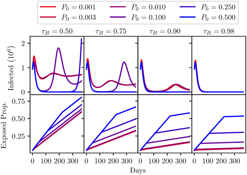
Fig 7. A comparison of different antibody test specificities τB shown from left to right, with varying levels of seroprevalence (P0) shown from red to blue.
Top: The number of infected individuals (I + QI population) over one year. Bottom: The proportion of the population that has been released from quarantine (S + I + R population) over one year. Model parameters are shown in Table 4.

