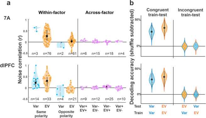
Fig. 4. Noise correlations and population decoding support separate representations of variance and EV.
a Noise correlations: Each violin plot shows the correlation coefficient for pairs of cells that were simultaneously recorded and had specific combinations of selectivity as noted on the x-axis. The numbers show the number of pairs in each distribution. The dots in each distribution show individual pairs; the larger points and whiskers show the median coefficient and 25th and 75th percentiles. Distributions that are significantly higher than 0 (p < 0.05) are shown with black dots and whiskers, otherwise they are shown with white dots and gray whiskers. “Within-factor” distributions show pairs in which both cells were selective to EV or both were selective for variance, further separated by whether the two cells had the same encoding polarity (EV+/EV+ or EV−/EV−, variance+/variance+ or variance−/variance−) or opposite polarity (EV+/EV− or variance+/variance−). “Across-factor” distributions show the coefficients for pairs in which one cell was selective for EV and the other for variance, further separated by polarity as noted. b Classification accuracy based on population responses: Each violin plot shows the distribution of accuracy across 200 bootstrap iterations (after subtracting the accuracy in a randomized dataset). The large dot and error bars show the average accuracy and 95% confidence intervals, with above-chance classification shown with black dots and whiskers. The different distributions correspond to different train/test regimes, as indicated by the x-axis and colors (test variable: dot color; train variable: outline color; orange: EV; blue: variance).

