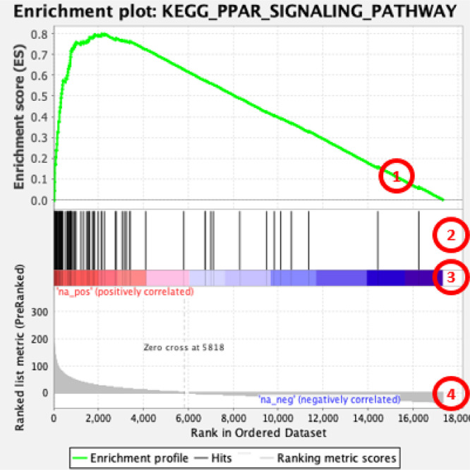
Fig. 2.
GSEA plot interpretation (based on example of enriched ‘PPAR signalling pathway’ from KEGG collection of datasets): 1 − running enrichment score for the gene set; 2 − vertical lines show where the members of the gene set appear in the ranked list of genes; 3 and 4 – list of genes ranked based on values for chemical-gene interactions from the gene with highest values of interactions (left of the plot) to gene with smallest number of interactions (right of the plot). Number of interactions is shown in the heat-bar (3) and in the bar plot (4). Values of chemical-gene interactions were adjusted to achieve equal negative and positive area under the curve for these values distribution – see Fig. 1.

