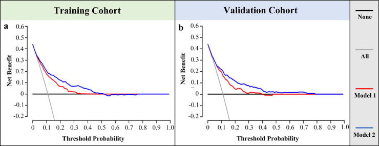
Fig. 5.
The decision curve of the nomograms for the prediction of MMR status. The x-axis and y-axis represent the threshold probability and the net benefit, respectively. The red line and blue line represent the pathology-based model and the combined model, respectively. The grey line and black line represent the strategy of conducting IHC-testing for every patient and none. (a) and (b) represent the decision curve of our nomograms in the primary and validation cohort.

