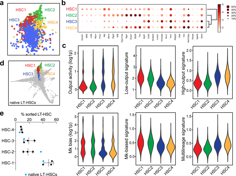
Extended Data Figure 3. Description of HSC subclusters.
a, SPRING plot showing the localization of the four reproducible HSC subclusters, HSC1–4. The plot is representative of one of three experiments with similar results. b, Marker gene expression for HSC subclusters. c, Violin plots showing the values for output activity, Mk-bias, and the scores of different HSC behaviour signatures. Violin plots show all the data (min-to-max) and are representative from one of 3 independent experiments (nHSC1=2206, nHSC2=577, nHSC3=1794, nHSC4=649). DPA results (p-values) are indicated for each HSC cluster in order from HSC1 to HSC4. Low-output: 0.0023, 0.0051, <0.0001, 0.0114. High-output: <0.0001, 0.3883, <0.0001, 0.0006. Mk-bias: 0.0002, 0.0172, 0.0516, 0.0182. Multilineage: 0.2257, 0.0763, 0.4374, 0.1977. d, SPRING plot showing distribution of native LT-HSCs (n=1) mapped by approximate nearest neighbors (see Methods). e, Cluster distribution of native LT-HSCs (blue dots) compared to transplant HSCs (black dots). Mean±S.D., n=3. Chi-square test (transplant HSCs vs. native LT-HSCs), pexp1=10−8, p exp2=0.0007, p exp3=0.0483.

