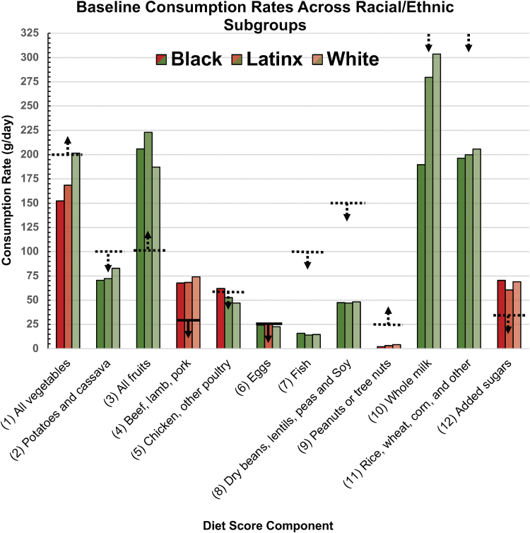
FIG. 3.
Baseline racial/ethnic consumption rates compared with diet score criteria. The dashed horizontal lines and arrows are visualizations of diet score criteria (refer to the “Point Criteria” column of Table 1), where upward-pointing arrows denote equal to or greater than the criterion consumption rate (value indicated on y-axis) and downward-pointing arrows denote less than or equal to the criterion consumption rate. Solid horizontal lines and downward-pointing arrows denote a criterion of less than the criterion consumption rate. Green bars indicate that diet score criteria are satisfied or met, where the dark green bars are for blacks, medium green are for Latinx, and light green are for whites. Red bars indicate unmet criteria, where the dark red bars are for blacks, medium red are for Latinx, and light red are for whites. Another way to distinguish the racial/ethnic subgroup data is by clusters of three, where the first bar of each cluster is always representative of the black subgroup, the second always of the Latinx subgroup, and the third always of the white subgroup. This comparison yields a diet score of 7/12 for blacks, 7/12 for Latinx, and 9/12 for whites. Color images are available online.

