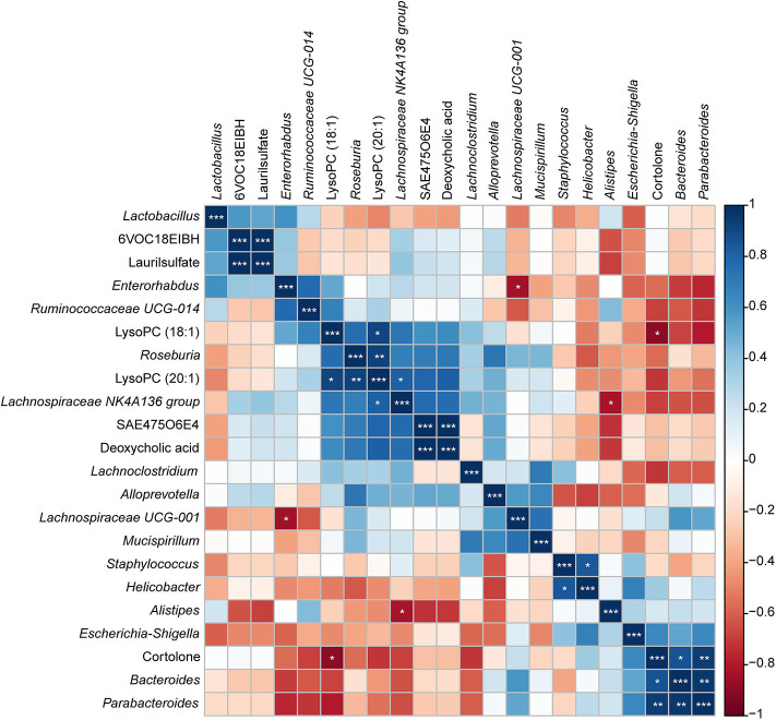
Figure 11.
Correlation plot showing the relationship between the altered metabolites from the colon and the top 15 abundant gut bacteria. The correlations between them are exhibited by colors; blue indicates a positive correlation, red indicates a negative correlation, and a darker color illustrates a stronger correlation (*p < 0.05, **p < 0.01, ***p < 0.001).

