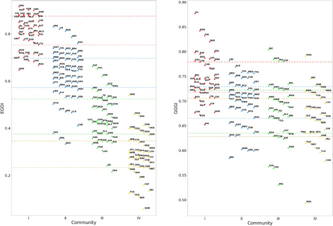
Figure 3.
Distribution of EGDI (left panel) and GGGI (right panel) indexes of UN countries, separated in communities I (red), II (blue), III (green) and IV (yellow). Dashed and dotted lines of the same color as communities represent the 25th and 75th percentile, respectively, of the associated community distributions. Notice that, while the horizontal grouping of points is related to the community membership of the countries they represent, the specific abscissa of a point is not meaningful. Higher-resolution versions of the above plots are reported in Supplementary Sec. S7.

