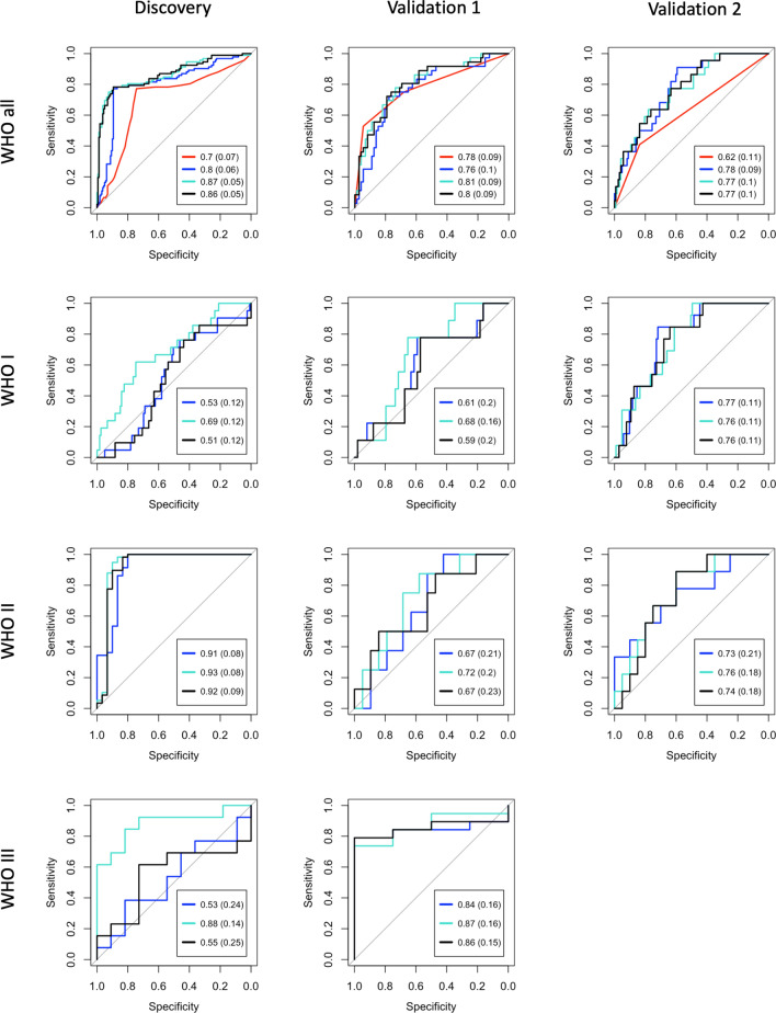
Figure 2.
Logistic regression classifier performance. For each receiver operative characteristic curve, black represents a model containing both modules while blue and turquoise correspond to their respective individual modules (SUZ12-enriched and E2F4/FOXM1-enriched, respectively). The top row (including all WHO grades) includes a red curve which represents the predictive accuracy of WHO grade alone. Note that with the exception of the black curves, each model contains a single predictive variable (metagene or WHO grade). Models in rows 2–4 include only individual WHO grades as labeled. Columns (left to right) represent performance on the discovery cohort (tenfold cross validation), merged microarray validation cohort (Validation 1), and RNA-seq validation cohort (Validation 2). For the models including all WHO grades, the red curves are statistically less predictive (DeLong p < 0.05) than all other curves in the Discovery and Validation 2 cohorts, while all curves in Validation 1 are similar to one another (DeLong’s p < 0.05).

