Figure 2.

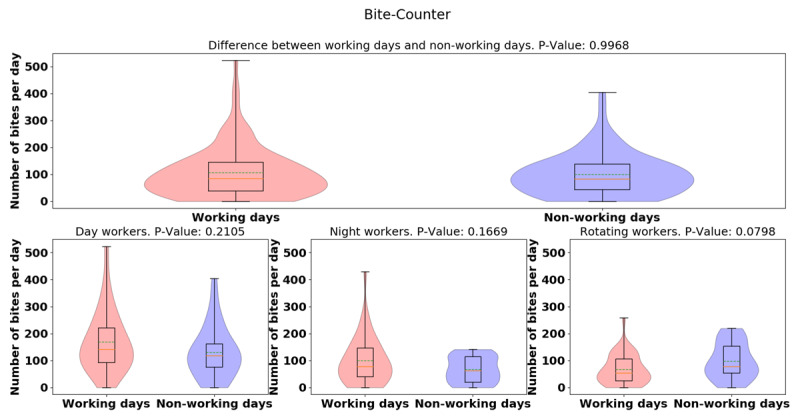
Violin plots of daily-average bite-counter data between working and non-working day for all groups (top) and for different groups (bottom sub-figures). Dashed green lines represent mean. Solid yellow lines represent median.

Violin plots of daily-average bite-counter data between working and non-working day for all groups (top) and for different groups (bottom sub-figures). Dashed green lines represent mean. Solid yellow lines represent median.