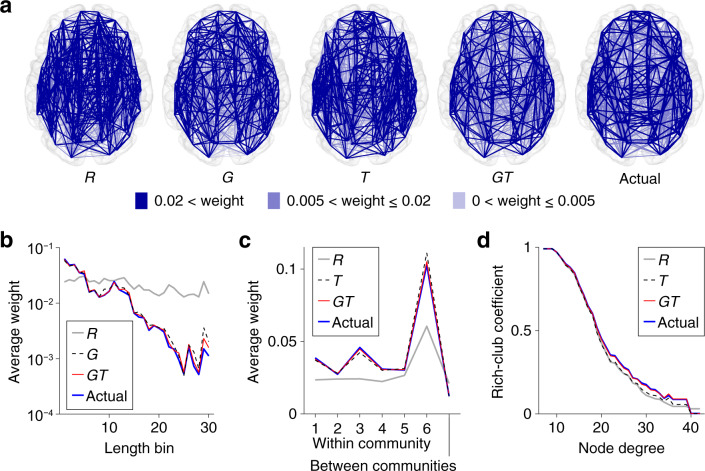
Fig. 3. Profiles of the surrogate and actual connectome data.
a Spatial layout of the connectome. Blue lines represent regional structural connections. Exemplars are shown for the surrogate data R, G, T, and GT. Edges with smaller connectivity weights are superimposed by edges with larger connectivity weights in these graph plots. b Connectivity weights averaged over edges within each bin of streamline lengths. The weight–length relationship of the actual data was preserved both in G and GT. c Connectivity weights averaged over edges within each community or between communities. The weight profile of the actual data over the horizontal axis was preserved both in T and GT. d The weighted rich-club coefficient7 (i.e. the ratio of the sum of edge weights between hub nodes to the sum of all edge weights). The coefficient profile of the actual data over the degree to define hub nodes was preserved in GT, but not in T.

