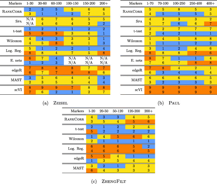
Fig. 2.
Performance of the marker selection methods on the (a) ZEISEL, (b) (PAUL), and (c) ZHENGFILT data sets as the number of selected markers is varied. There are two rows for each method; the first row for each method represents the classification metrics and the second row represents the clustering metrics. Blue indicates better performance than the other methods; orange indicates notably worse performance than the other methods. The marker bins are chosen to emphasize certain features in Figs. 4, 5, 6, 7, 8, 9 and 10; these figures present the values of the evaluation metrics for the different data sets. The values in the boxes correspond to a ranking of the methods, with 1 being the best method in the marker range. The classification and clustering results are ranked separately. Further notes: (a) All of the methods perform well on the ZEISEL data set - an orange box here does not indicate poor performance, but rather that other methods outperformed the orange one. (b) Many of the methods showed nearly identical performance according to the classification metrics; thus, this table contains many yellow boxes

