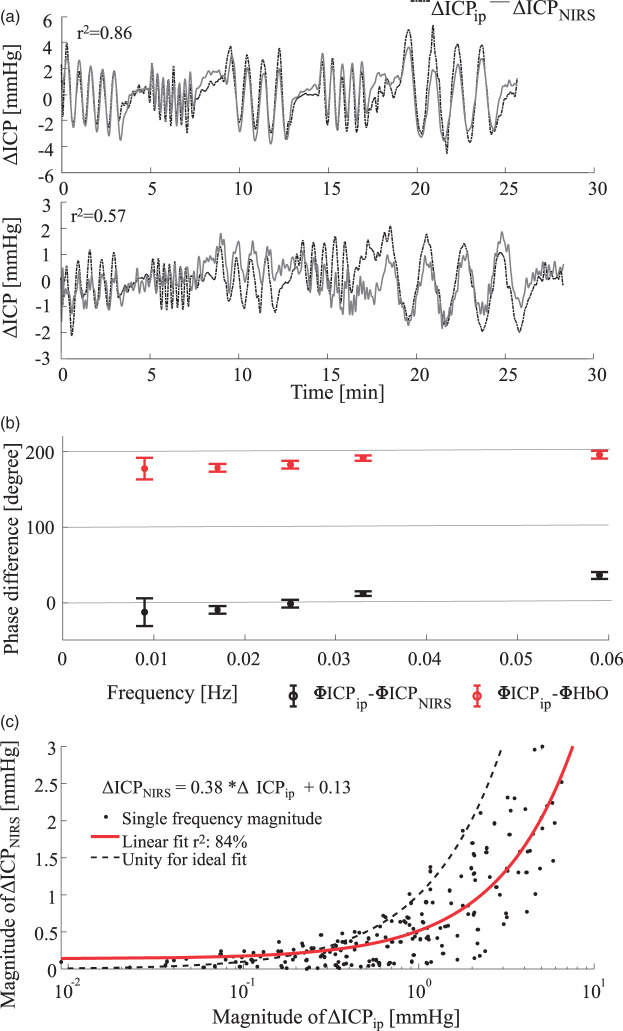
Figure 7.
(a) Comparison of invasive, parenchymal probe (dotted line) and non-invasive NIRS (solid line) ICP measurements. Top: Representative example of NHP 4 at a baseline of 40 mmHg. Bottom: Underestimation in animal 5 at a baseline of 40 mmHg. Pearson correlation is shown in the top left of both graphs. (b) Phase difference between invasively measured ICP and estimated NIRS-based ICPNIRS is shown as black error bars. The error bar indicates the standard deviation and the cross indicates the mean phase difference over all 157 single-frequency data sets. Similarly, the red line indicates the phase difference between invasive ICPip and measured ΔHbO. (c) Comparison of magnitudes after transfer function analysis. The red line indicates a linear fit to the magnitudes. The right sided, downward shift compared to the ideal unity line indicates a tendency for underestimation of the oscillation magnitudes.

