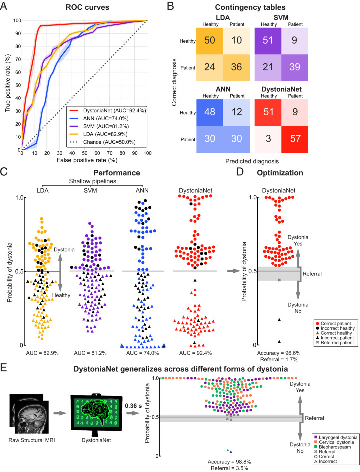
Fig. 3.
Performance of deep learning and shallow machine-learning pipelines. (A) Receiver operating characteristic (ROC) curves for each pipeline using the first independent test set of 60 patients with laryngeal dystonia and 60 healthy controls. The area under the ROC curve (AUC) values for each pipeline are reported in the key. The dotted line represents the performance of a random classifier. (B) The corresponding contingency tables report the number of healthy controls and patients who are correctly and incorrectly classified by each pipeline. (C) The diagnostic performance of each pipeline in the first independent test set of 60 patients with laryngeal dystonia and 60 healthy controls. Each symbol represents a subject. Subjects classified as patients are represented by circles; subjects classified as healthy controls are represented by triangles. Colored symbols represent correct diagnosis; black symbols represent misclassifications. The y axis represents the probability of dystonia as assessed by each pipeline; the gray line represents the decision boundary. The corresponding AUC values are given for each pipeline. (D) Optimized DystoniaNet with a dynamic range to maximize diagnostic performance in 60 laryngeal dystonia patients of the first independent test set. The gray shading represents the area of uncertainty where DystoniaNet refers the subject (gray cross) for further examination. The y axis represents the probability of dystonia; the gray line represents the decision boundary. The corresponding accuracy and referral rate are reported. (E) Testing of generalizability of the DystoniaNet-derived biomarker in the second independent test set of 172 patients with different forms of dystonia, including 59 patients with laryngeal dystonia, 59 patients with cervical dystonia, and 54 patients with blepharospasm. The pipeline shows the steps from the use of raw structural MRI as input to the final optimized DystoniaNet, which processes data and outputs the final diagnostic decision as dystonia-yes, dystonia-no, or referral within 0.36 s for each subject. Each symbol represents a subject. Subjects classified as patients are represented by circles; misclassified subjects are represented by triangles; referrals are represented by crosses. The y axis represents the probability of dystonia; the gray line represents the decision boundary; the gray shading shows the area of diagnostic uncertainty (referral). The corresponding accuracy and referral rate are reported. Data are visualized using the Matplotlib library (63).

