
Figure 1.
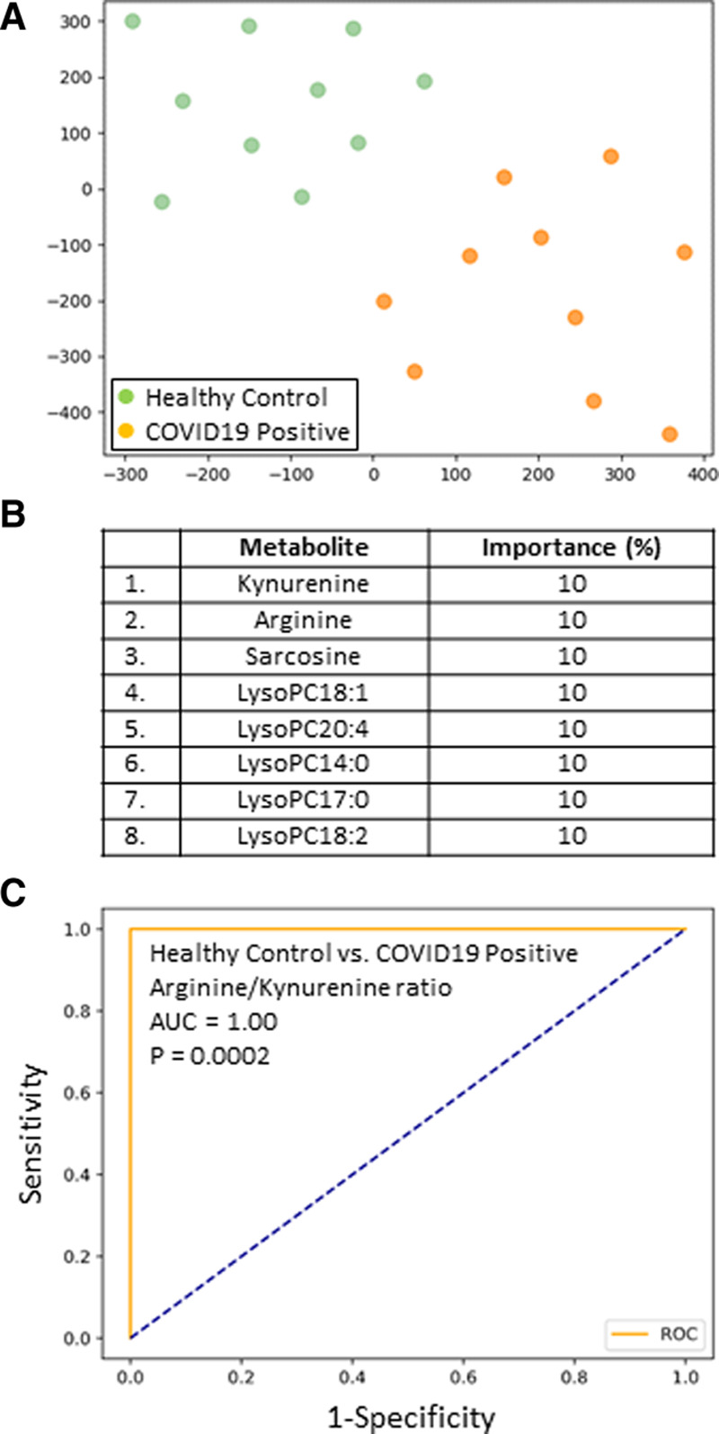
A, Subjects plotted in two dimensions following dimensionality reduction in their respective metabolites by stochastic neighbor embedding. Green dots represent healthy control subjects, whereas orange dots represent age- and sex-matched coronavirus disease 2019 positive (COVID19+) ICU patients (ICU day 1 plasma). The dimensionality reduction shows that based on the plasma metabolites, the two cohorts are distinct and easily separable. The axes are dimensionless. B, Feature classification, demonstrating the top eight plasma metabolites that classify COVID19+ status versus healthy control subjects with their % association. C, Receiver operating characteristic analysis of healthy control subjects versus COVID19+ patients, using an arginine/kynurenine ratio, demonstrates an area-under-the-curve (AUC) of 1.00 (p = 0.0002). The cutoff value is 15.6. The diagonal broken blue line represents chance (AUC 0.50).