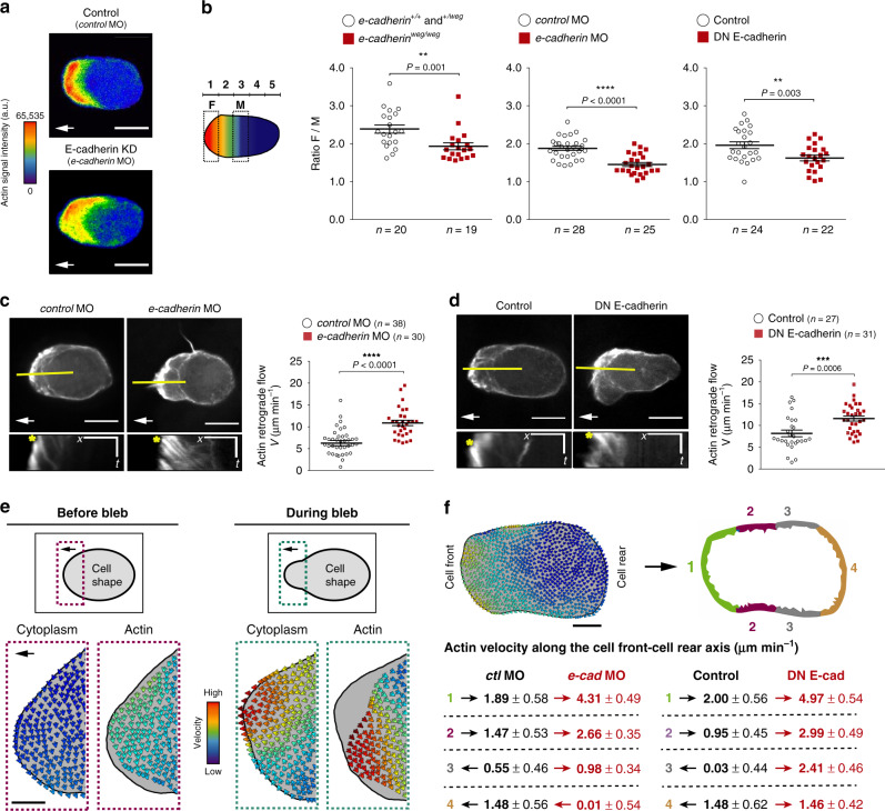
Fig. 2. Effect of E-cadherin depletion on actin distribution and dynamics within migrating PGCs.
a Color-coded actin (LifeAct-EGFP) fluorescence intensity in a control cell (upper panel) and in an E-cadherin-depleted cell (lower panel). White arrows indicate the migration direction; scale bars, 10 μm. Cells are derived from the same data sets presented in b and in Supplementary Fig. 4a, b. b Left panel: schematic illustration of the division of the cell into 5 domains employed in the quantitation presented on the right. The ratio between the mean value of LifeAct-EGFP signal in segment 1 (F, front) and that in segment 3 (M, middle) was calculated. Graphs: F/M ratios for control cells and E-cadherin-depleted cells (e-cadherinweg/weg mutants (left graph), e-cadherin morpholino-injected embryos (middle graph), and DN E-cadherin-expressing PGCs (right graph)). n = number of cells from 5 independent experiments for e-cadherinweg/weg mutants and 4 independent experiments for the other conditions; mean ± s.e.m.; P value: two-tailed Mann–Whitney U-test. Data derived from the same sets of cells analyzed in Supplementary Fig. 4a, b. c, d Upper panels: representative polarized PGCs (control cells and cells treated with either e-cadherin morpholino (c) or DN E-cadherin (d)) expressing LifeAct-EGFP. White arrows indicate the direction of migration; scale bars, 10 μm. Lower panels: kymographs along the yellow lines in the upper panels. Yellow stars mark the starting position on the cell border where kymograph measurements were conducted (see Methods for further details). Scale bars, x = 5 μm, t = 12 s (s = seconds). Graphs: actin velocity values at the cell front derived from the kymographs. n = number of velocities from 8 independent experiments for morphants (c) and 6 independent experiments for DN E-cadherin (d); mean ± s.e.m.; P value: two-tailed Mann–Whitney U-test. e Upper schematics: representative shape of a polarized PGC before (left) and after (right) bleb initiation. Black arrows indicate the direction of migration. Dotted rectangles mark the regions of the cell front, which are magnified in the panels below. Lower panels: Color-coded arrows represent the direction of flow of cytoplasm (cytosolic EGFP) and actin (LifeAct-mCherry) at the cell front of a representative migrating PGC before (left, purple panels) and during bleb (right, green panels). For both channels, the arrows indicating the flow are placed on top of the cell contour derived by edge detection for the cytoplasmic signal (gray background). The partial snapshots are derived from the time points 6.0 s and 12.5 s in the Supplementary Movie 2. Cytoplasmic EGFP: red = 44.4 μm min−1; blue = 0.0 μm min−1. LifeAct-mCherry: red = 46.8 μm min−1; blue = 0.0 μm min−1. Black arrow indicates the direction of migration; scale bar, 5 μm. f Measurements of actin velocity along the cell perimeter performed using the BioFlow software (see Methods). Snapshot: the length of the cell contour was divided into four equal parts with an average width of 1.7 μm. The mean actin velocity values along the cell front-rear axis within these regions were calculated for 10 s prior to bleb formation. The presented snapshot corresponds to an example control cell: red = 28.2 μm min−1; blue = 0.0 μm min−1. Scale bar = 5 μm. Tables: black and red arrows indicate the direction of actin movement with respect to the cell front-rear axis. Values indicate mean ± s.e.m. Data are derived from the same sets of cells analyzed in c, d. Source data are provided as a Source Data file.

