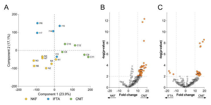
Figure 3.
(A) Principal component analysis (PCA) biplot that shows distribution of samples according to Components 1 and 2. Each circle represents a sample, which are labelled and colored according to their group. Volcano plots depict the differentially expressed proteins (B) between CNIT and NKF, and (C) between CNIT and IFTA. Each circle represents a protein. On y-axis −log(p-value) from a t-test is represented, with a dashed line at p < 0.01 to indicate significance, over which proteins are colored in orange. The expression fold change is represented on the x-axis, with dashed lines at >10 and <−10.

