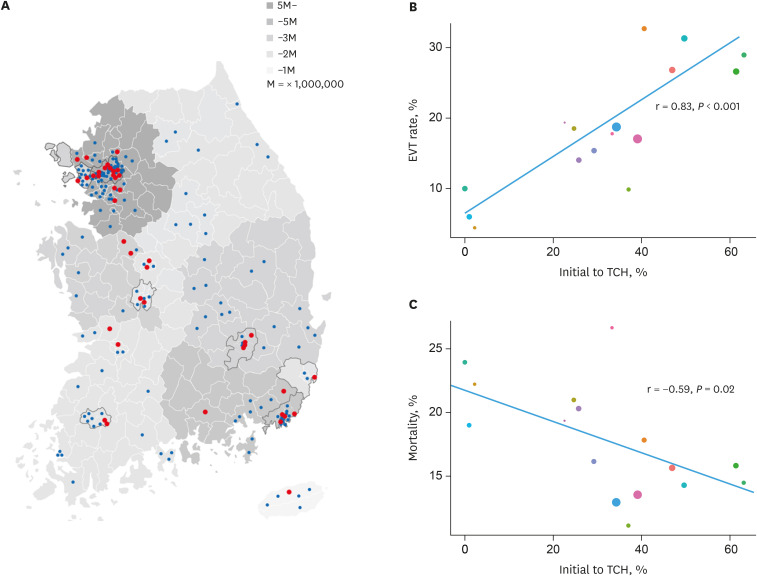
Fig. 3. Acute stroke care hospitals in Korea. Distribution of TCHs and PSHs (A) and correlations between routing to a TCH and treatment (B) and mortality (C). Distribution of TCHs and PSHs on a map of the population density of the Republic of Korea (A). Plots depicting the correlation between the proportion of those initially routed to a TCH and EVT rates (B) and those initially routed to a TCH and 1-month mortality (C) based on region. Red circles represent TCHs and blue circles represent PSHs. Population density is reflected by the intensity of grey (A). Circles denote individual regions whereby the color represents different area and size depending on the number of thrombectomy-screening candidates (B). Correlations were estimated with Pearson's correlation test.
EVT = endovascular treatment, TCH = thrombectomy capable hospital, PSH = non-thrombectomy capable hospital.

